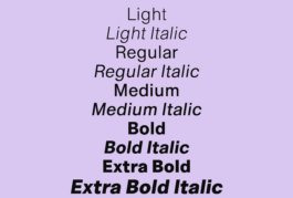
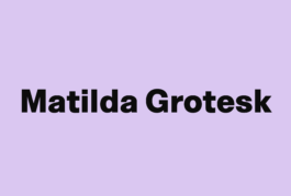
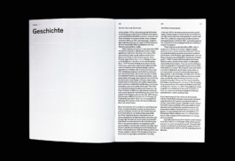
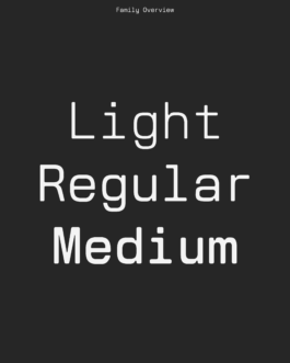
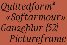
Matilda Grotesk
Matilda Grotesk is a straightforward bog-standard sans serif with a softer, more open reading of the genre. Generous counters, soft curves, and a single-storey g give the family a relaxed tone suited to text, captions, labels, and interface use.

Kynema
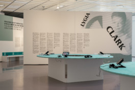
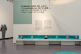
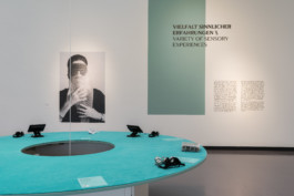
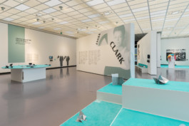
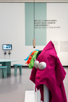
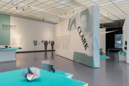
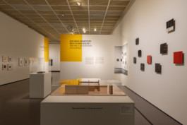
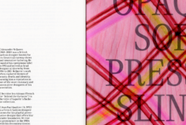
Kynema is a sans serif typeface developed for the exhibition Lygia Clark. Retrospektive at Kunsthaus Zürich (14 November 2025 – 8 March 2026). Taking cues from Clark’s investigations into perception, the body, and participation, it approaches typographic form as something to be felt as much as read. Its name combines kinema and cinema, suggesting movement, shifting viewpoints, and a sense of presence.
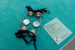
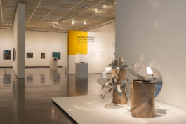
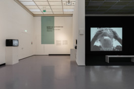
Lygia Clark was a key figure of the South American avant-garde and Neoconcretismo. Her work dissolves the distance between artwork and viewer, inviting an embodied and sensory experience of art as an open process.
In cooperation with Neue Nationalgalerie Berlin and Associação Cultural O Mundo de Lygia Clark.
Curator: Cathérine Hug
Exhibition design: Lena Huber
Installation views: Lygia Clark. Retrospektive, Kunsthaus Zürich
Works: © Associação Cultural O Mundo de Lygia Clark
Photography: Franca Candrian
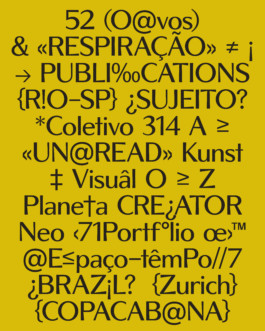
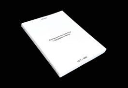
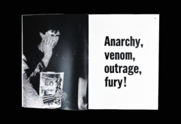
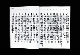
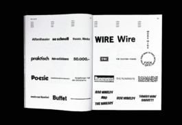
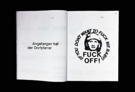
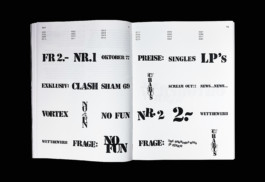
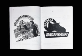
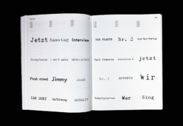
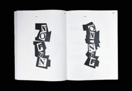
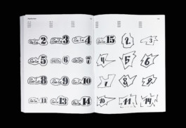
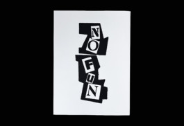
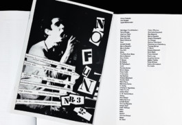
No Fun: Eine Typografische Sammlung (1977 – 1980)
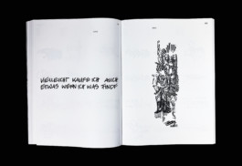
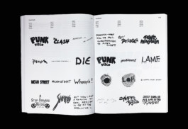
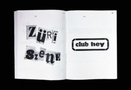
My Bachelor diploma project explores the typographic elements of No Fun, the first Swiss punk fanzine, published between 1977 and 1980. This edition, which was nominated for the Prize of Excellence 2026 by the Fondation Hans Wilsdorf, catalogs and classifies various typographic elements into categories such as Serif, Sans Serif, Handcrafted, Collage, Typewriter, and Page Numbers. At the time, No Fun defined the visual identity of the Swiss punk scene with bold typographic choices and innovative layouts. This collection preserves this creative heritage and serves as a valuable resource for contemporary designers, illustrating how typography can be a powerful vehicle for culture and artistic expression.
The goal of this edition is to document and celebrate the typographic choices of No Fun. It showcases the creative use of typography in this fanzine. My approach includes a detailed study of No Fun issues, the classification of the typographies, and the creation of an edition bringing together these visual elements.
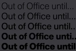
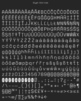
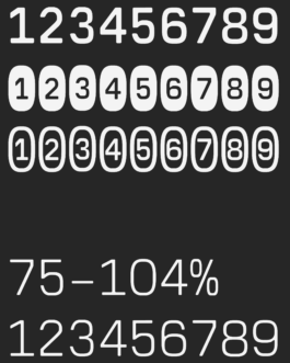
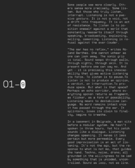
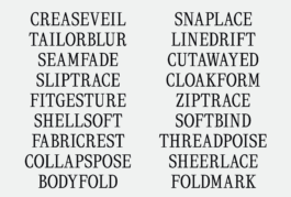
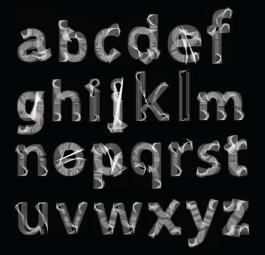
Arci Mono
Arci Mono is a monospaced variable typeface that borrows its logic from modular synthesizers and technical interfaces. The strict repetition of the monospace grid mirrors the fixed steps of a sequencer, while the letterforms themselves retain a softness that resists mechanical hardness.
The project is accompanied by a series of texts that take the language of signal processing as their framework. Signal source → delay → noise floor → refusal → output. These chains are metaphors for listening, for how attention drifts, interrupts, and transforms. Typography here is not silent but part of a circuit: input, filter, output.
Developed at ECAL in a course led by Radim Peško, the typeface takes its name from Arci Bellezza in Milan, a space where music, echo, and collective presence shaped the atmosphere of the work.


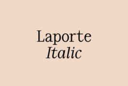
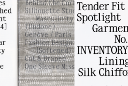
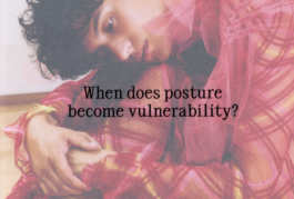
Laporte
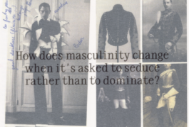
LAPORTE is a typeface shaped by structure, tension, and the friction of roles. Developed during the Optical Size course at ECAL under the guidance of Kai Bernau, it exists in two cuts: a brittle display and a denser text. The typeface draws from “Derrière les rideaux”, a fashion collection by Hippolyte Laporte (Finalist of the Swiss Design Awards 2025). He was working with five masculine figures: the banker, the mechanic, the athlete, the lumberjack, the businessman. Each enters already inscribed with cultural weight.
*if you'd like to purchase this font, please get in touch by email
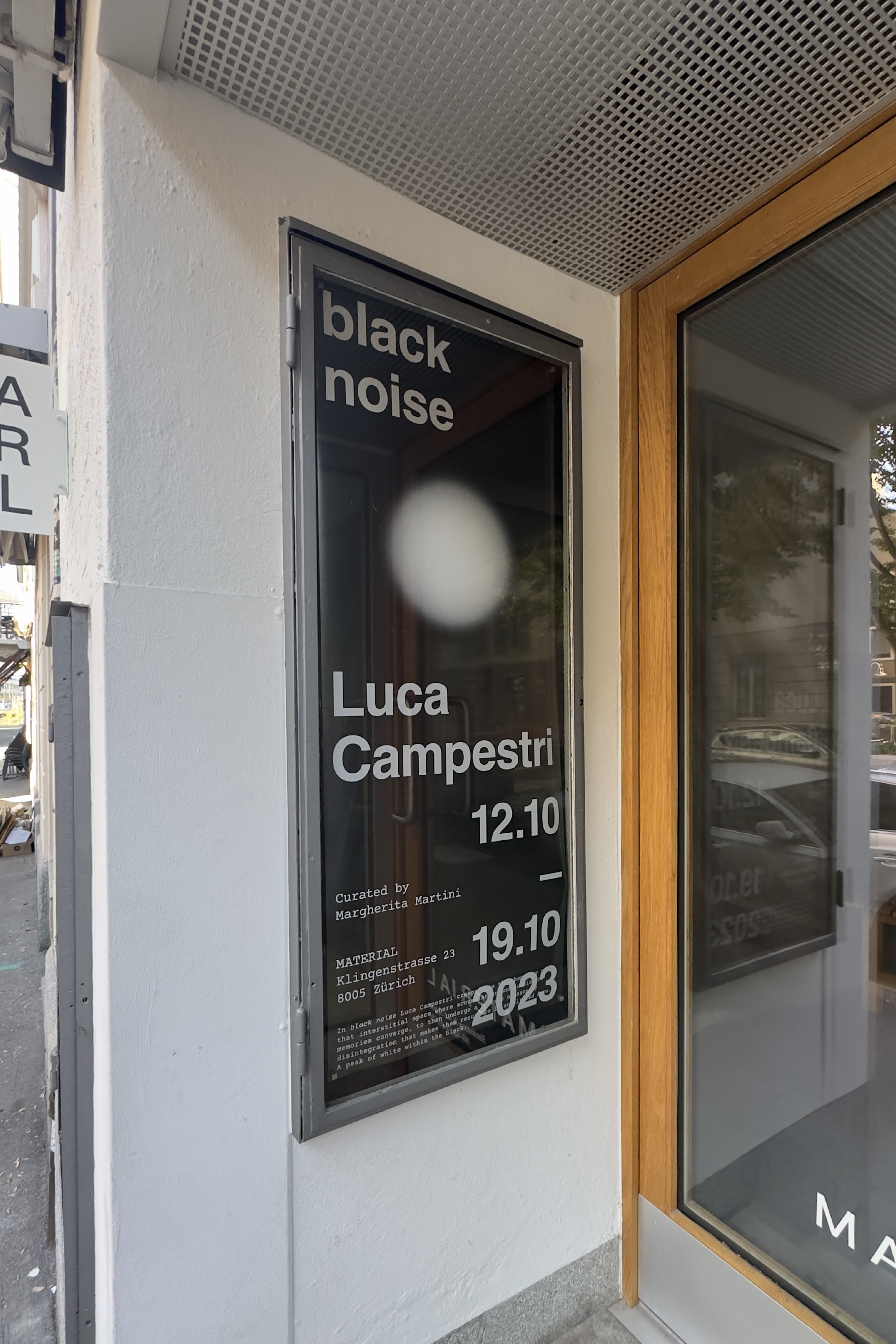
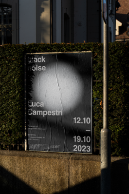
black noise, Luca Campestri
Poster design for the black noise exhibition, Luca Campestri at MATERIAL, Raum für Buchkultur in Zurich.
The poster was made available for sale during the exhibition.
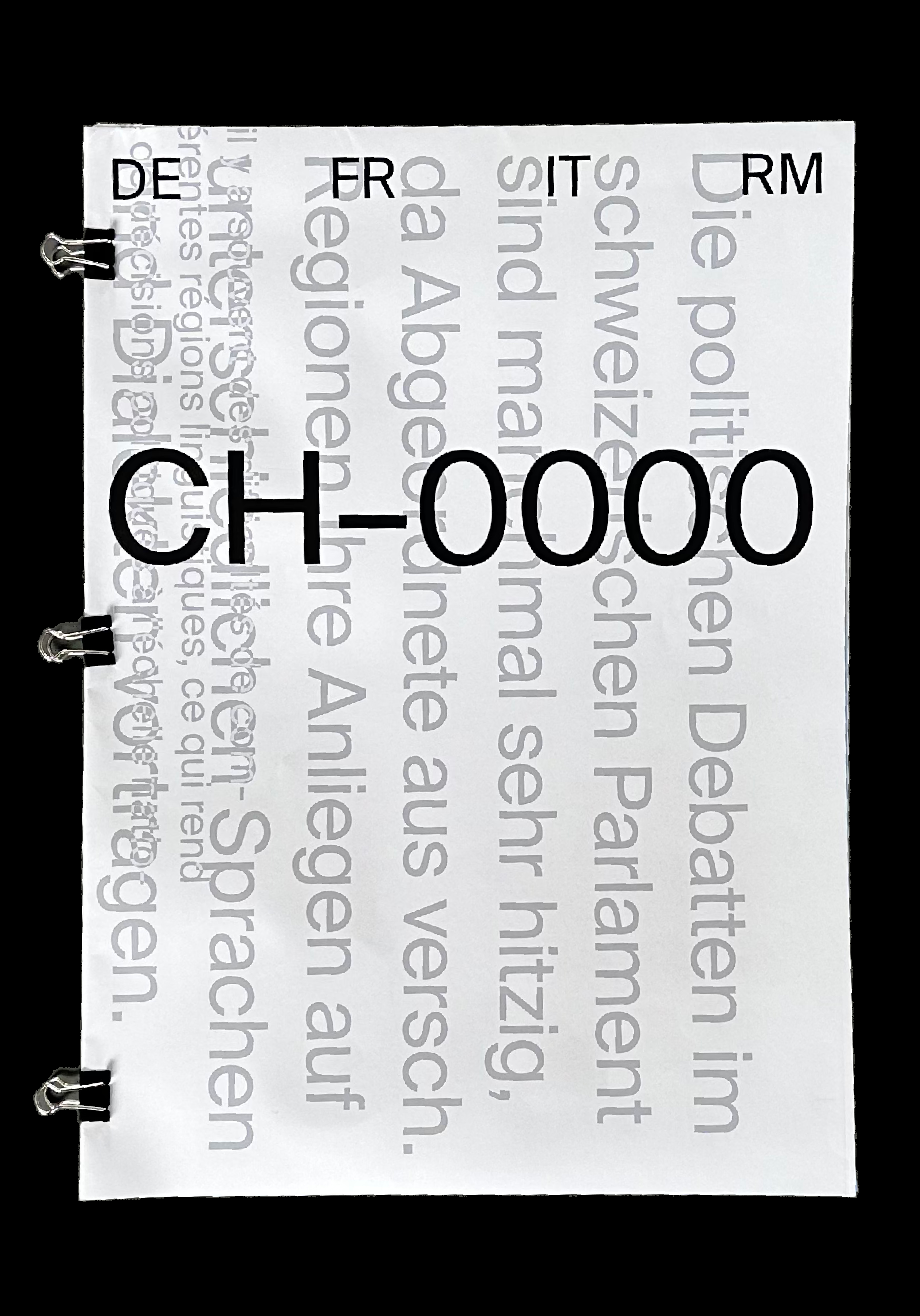
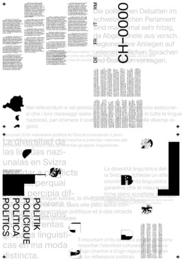
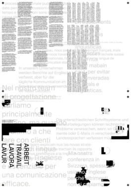
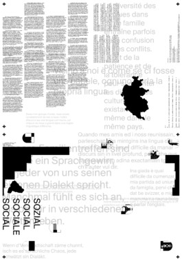
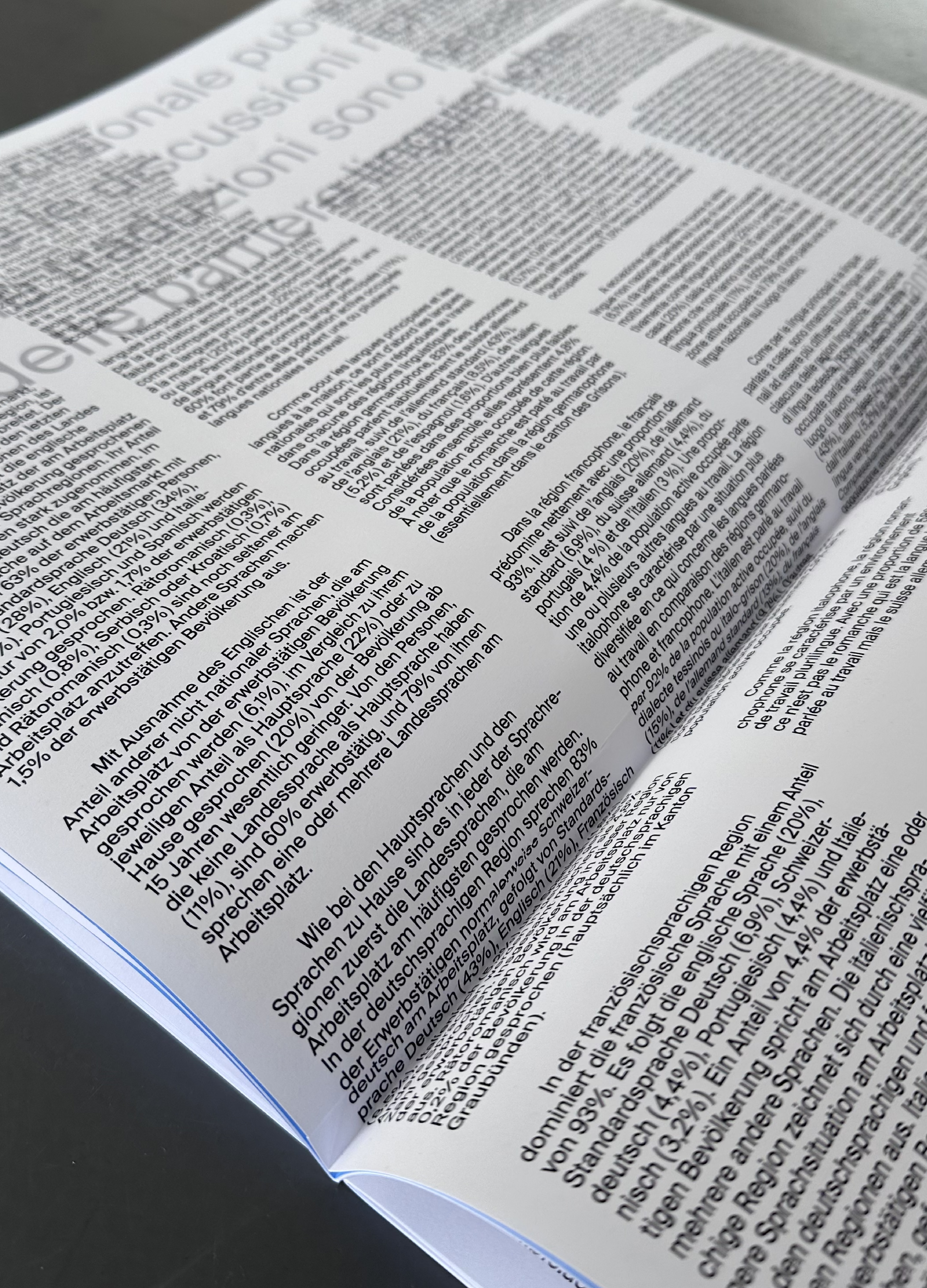
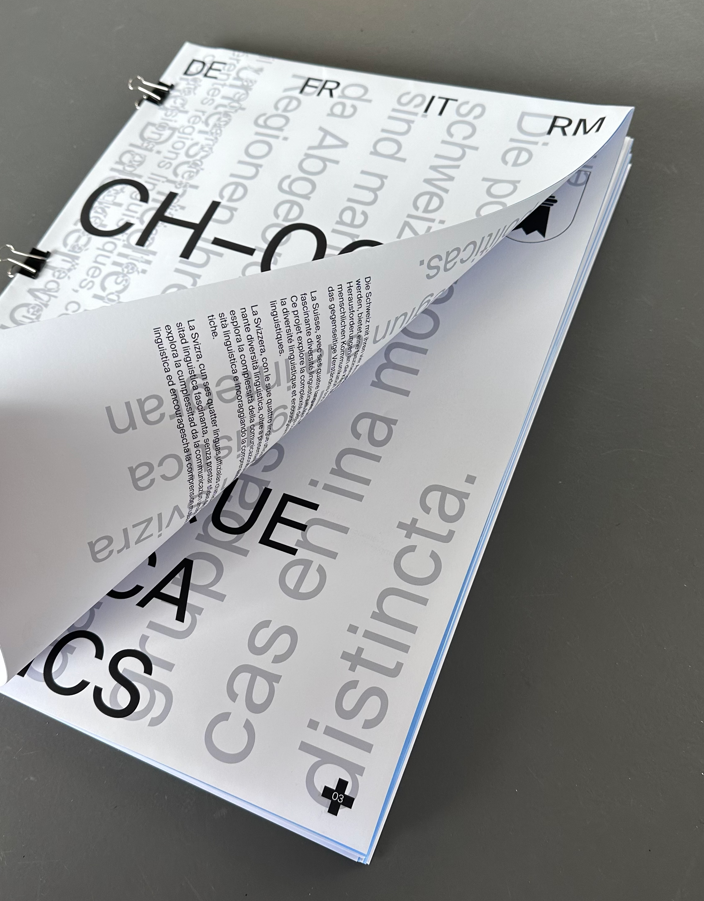
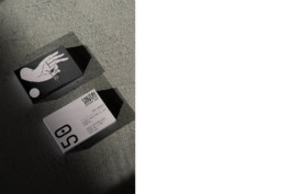
CH–0000
This project explores the diversity of human communication through extracts from real conversations, highlighting the complexity and misunderstandings that can arise. It aims to preserve the richness of communication while reminding us of the importance of mutual understanding, even in a multilingual society like Switzerland, where linguistic diversity can create ‘battle lines’ that make communication difficult. This edition offers a complex reading experience by partially concealing its pages, encouraging the reader to search and reflect while promoting understanding.
In collaboration with Mathilde Périat.
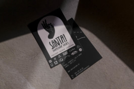
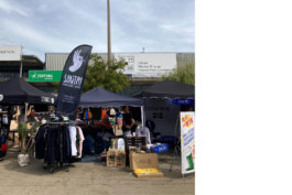
Santai Skateshop, Vevey
Creation of flyer, gift card, beach flag and fidelity card
Featured at the World Skate Tour 2023, Lausanne
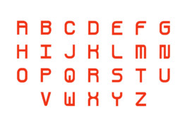
ESP’ASSE
In collaboration with Ewan Mesa.
ESP'ASSE Typeface emerged from the delightful surprise of stumbling upon an intriguing print adorning an old barrel found within a time-worn building on the site. This unique typeface creation played a key role in our signage proposal for Esp'Asse Nyon, a collaborative effort alongside Ewan Mesa, Marine Goeke, Maëlie Richard, and Hamza Essabbani.
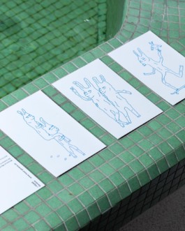
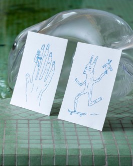
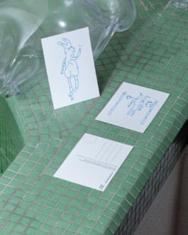
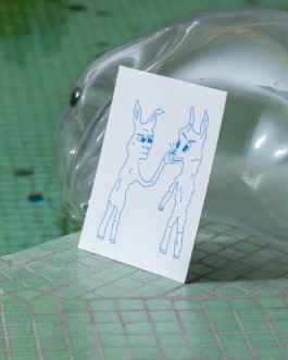
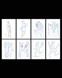
Whimsical Wanderings
As part of a week-long workshop led by Thomas Perrodin, students came up with a series of illustrations that convey the HEAD's values in a symbolic and dreamlike way.
The Collectibles series brings together the limited production of objects and creations conceived and produced by students at HEAD-Geneva. The concept and production of these artefacts are a practical application of the school's teaching principles. Each series is unique and themed.
Bundle of 8 postcards available at HEAD Store (limited).
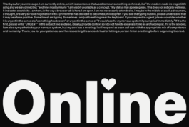
Moral Crossroad
Thoughts come and go, words are constructed and deconstructed. Everything is connected and yet words are floating by themselves.
Interaction Design
View website online moralcrossroad.netlify.app (desktop only)
Perlin Noise
Interactive typography, created using p5.js, incorporates a Perlin Noise function based on random gradient values at grid points.
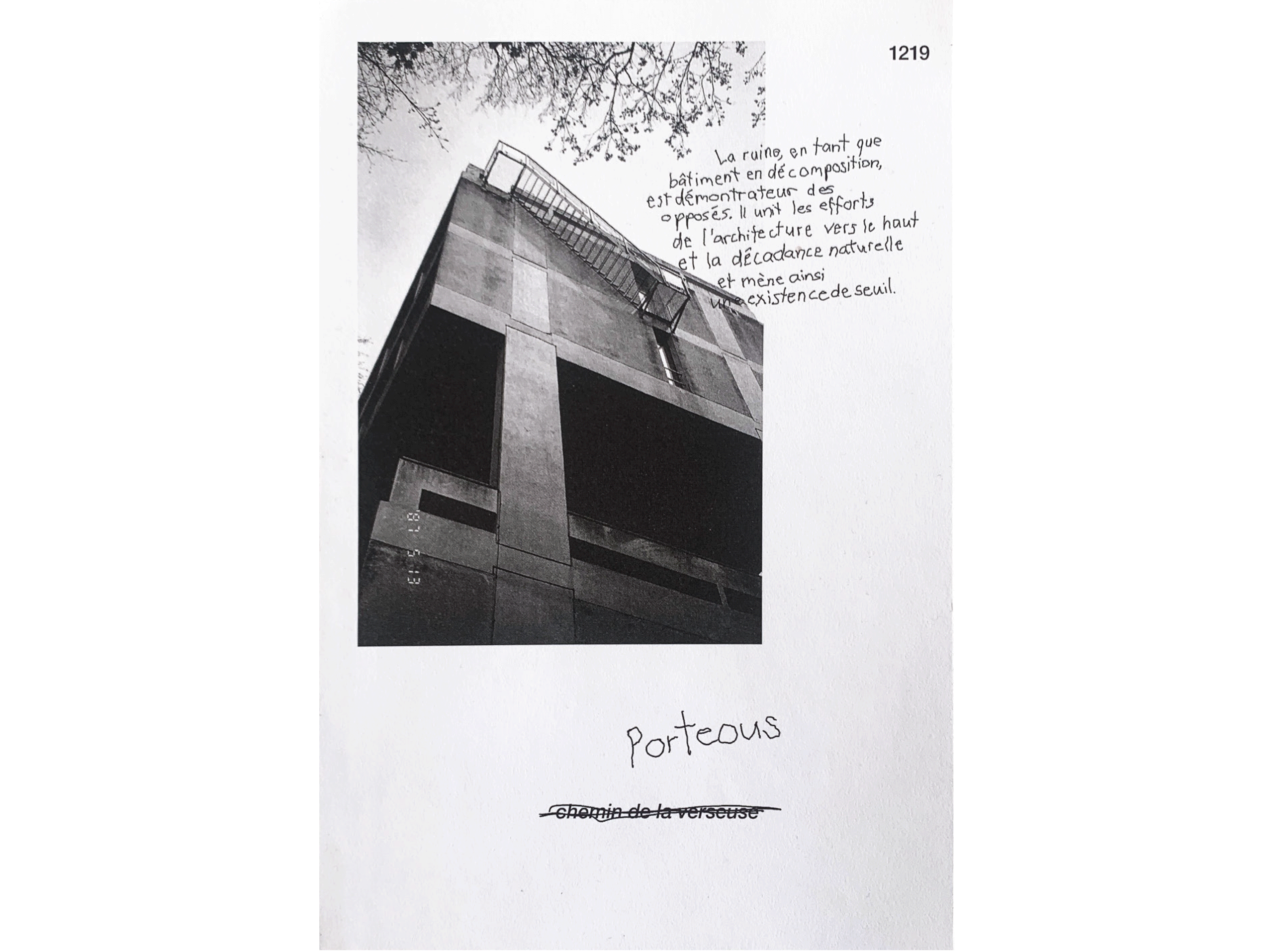
Porteous
"Learning from Geneva – Texts and Images in the Public Domain" entailed a project where a particular street in Geneva was selected for a holistic exploration, culminating in the creation of an editorial piece. The photographs were deliberately captured using analog techniques and developed by hand. The written content revolves around the street itself, encompassing personal observations, emotions, and historical context, offering a multifaceted perspective.